As a tea > coffee enthusiast, I was super excited when I got the opportunity to work on the logo design of a new Montreal-based tea and wellness brand!
Positivithé's (or Positivitea) story was to recommend and sell tea catered towards different aspects of relaxation and positivity, while spreading knowledge about wellness and creating communities around these values.
The key design points were to include aspects of positivity, wellness imagery, and throw hints at 'tea' while not making it the main focus of the visual identity.
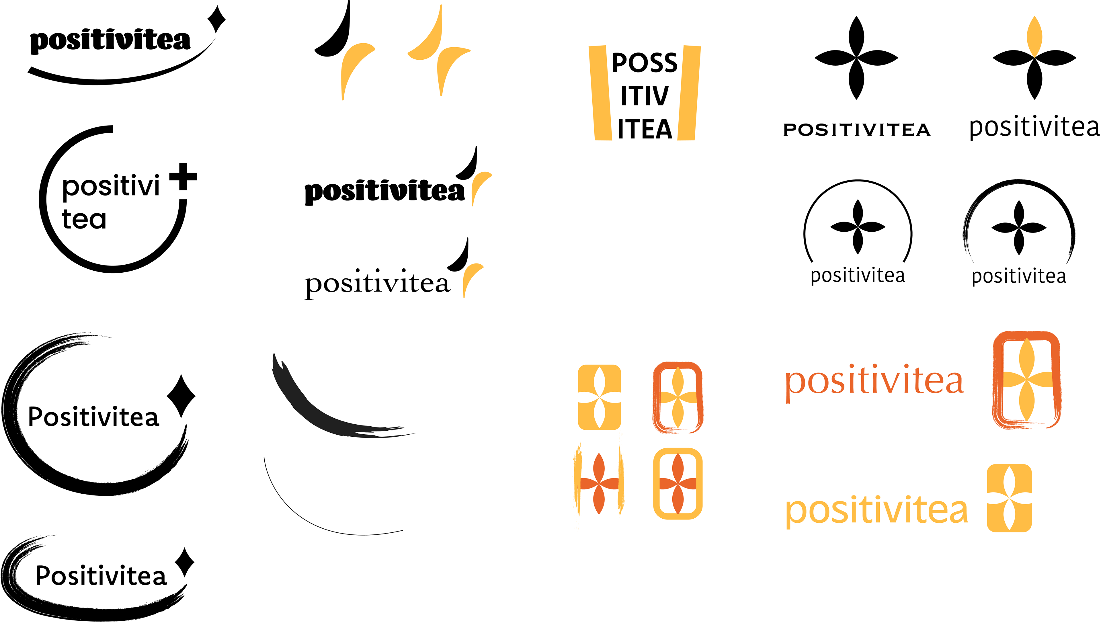
After doing some research on tea and wellness brands, I played around with using different types of symbols like plus signs, leaves, sparkles, and cups while also trying to find ways to ground the symbols, such as within calligraphy brush strokes, within square stamp formats, and circles.
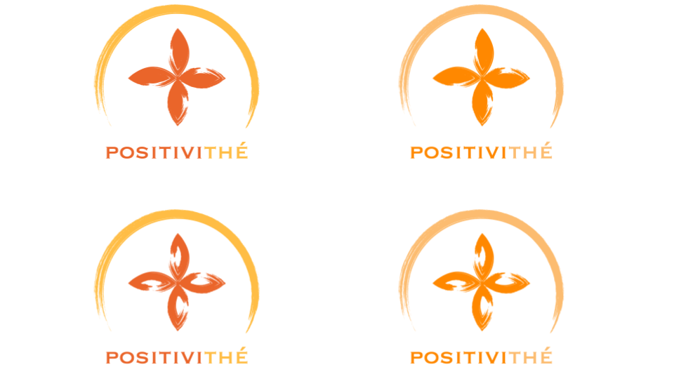
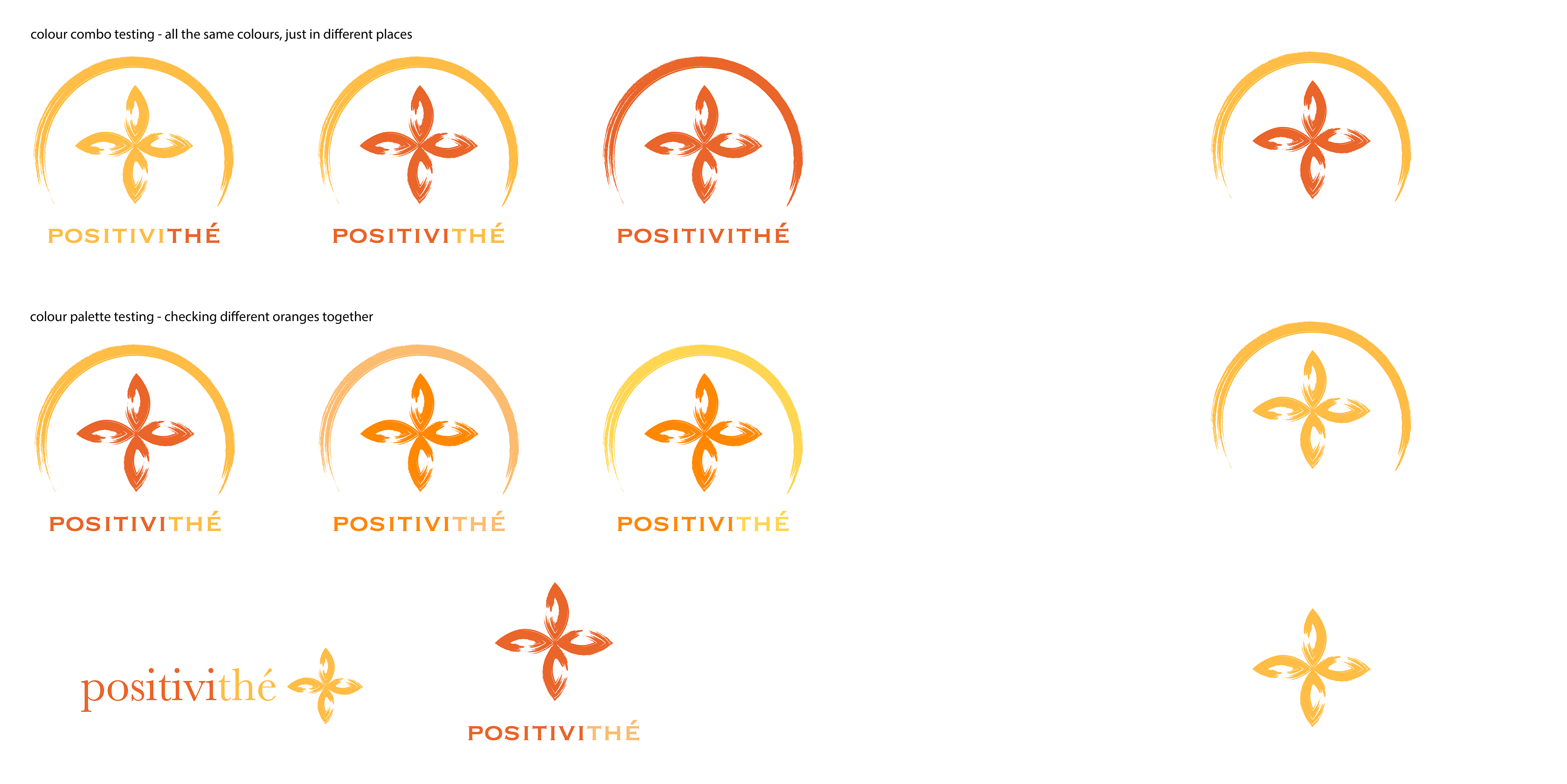
The client really liked this design, where leaves form a plus sign, but wanted to include more of the calligraphy aspect which referenced wellness practices and imagery. I played around with how to use the symbol, placement of calligraphy, and colour.
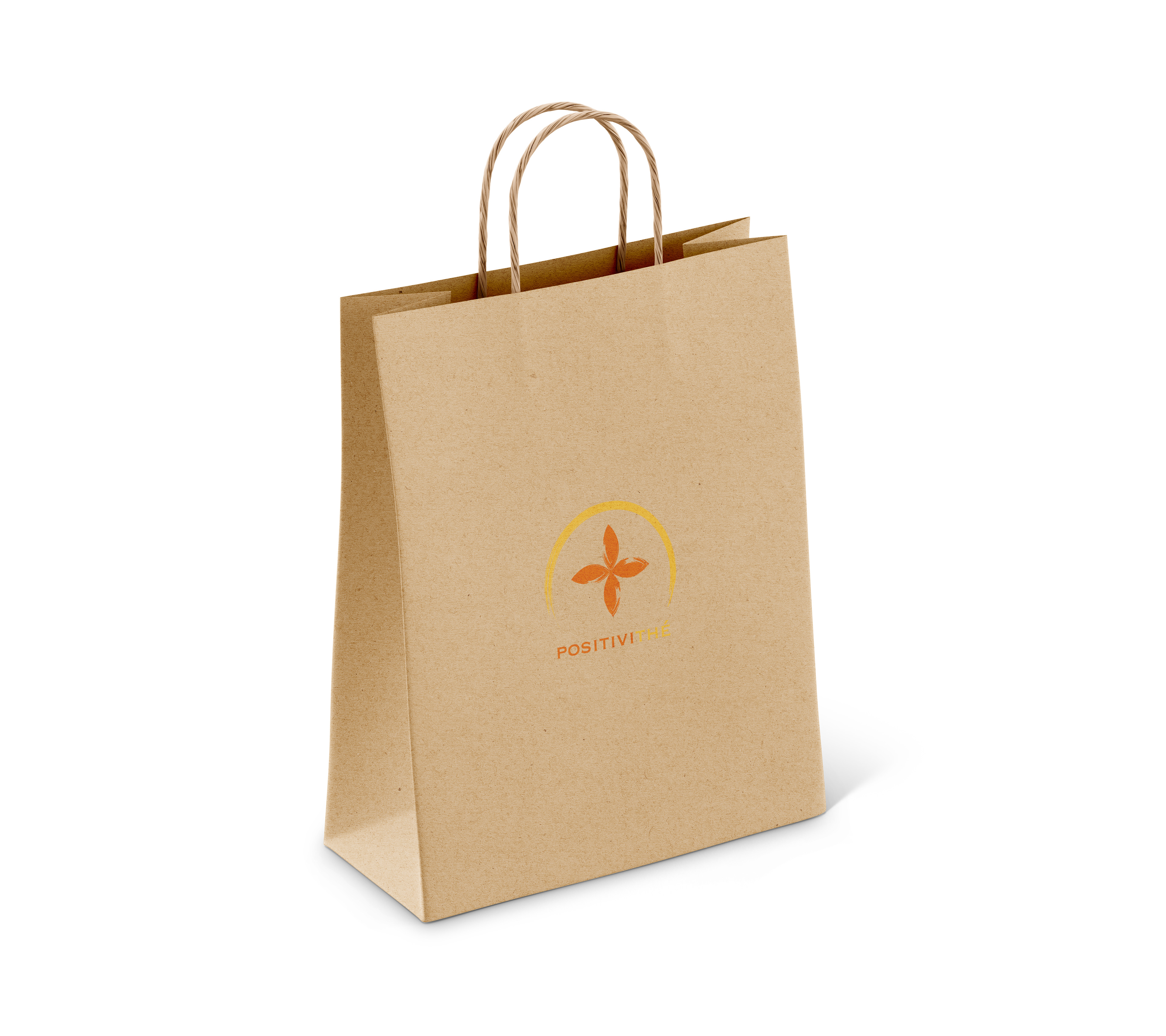
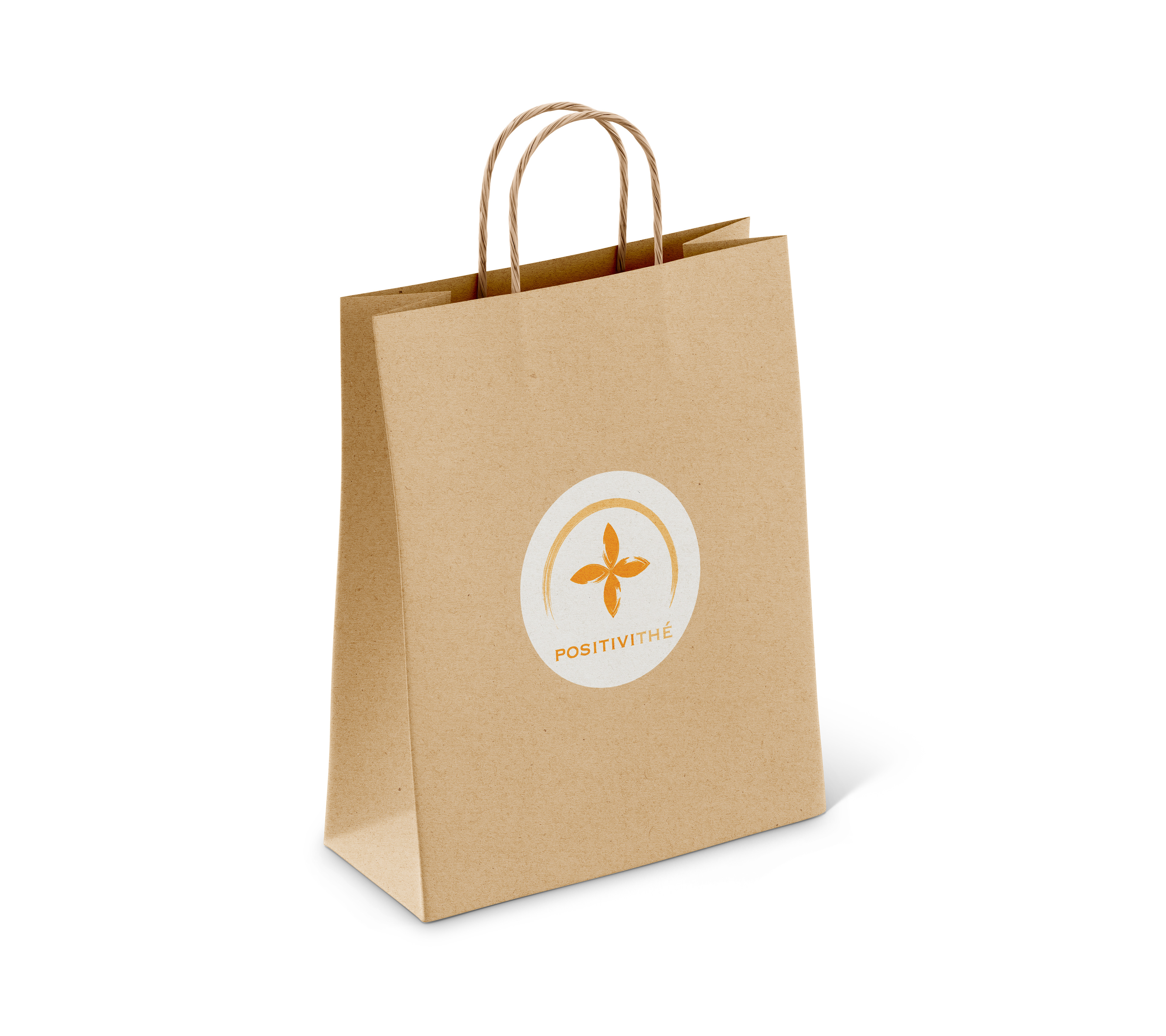
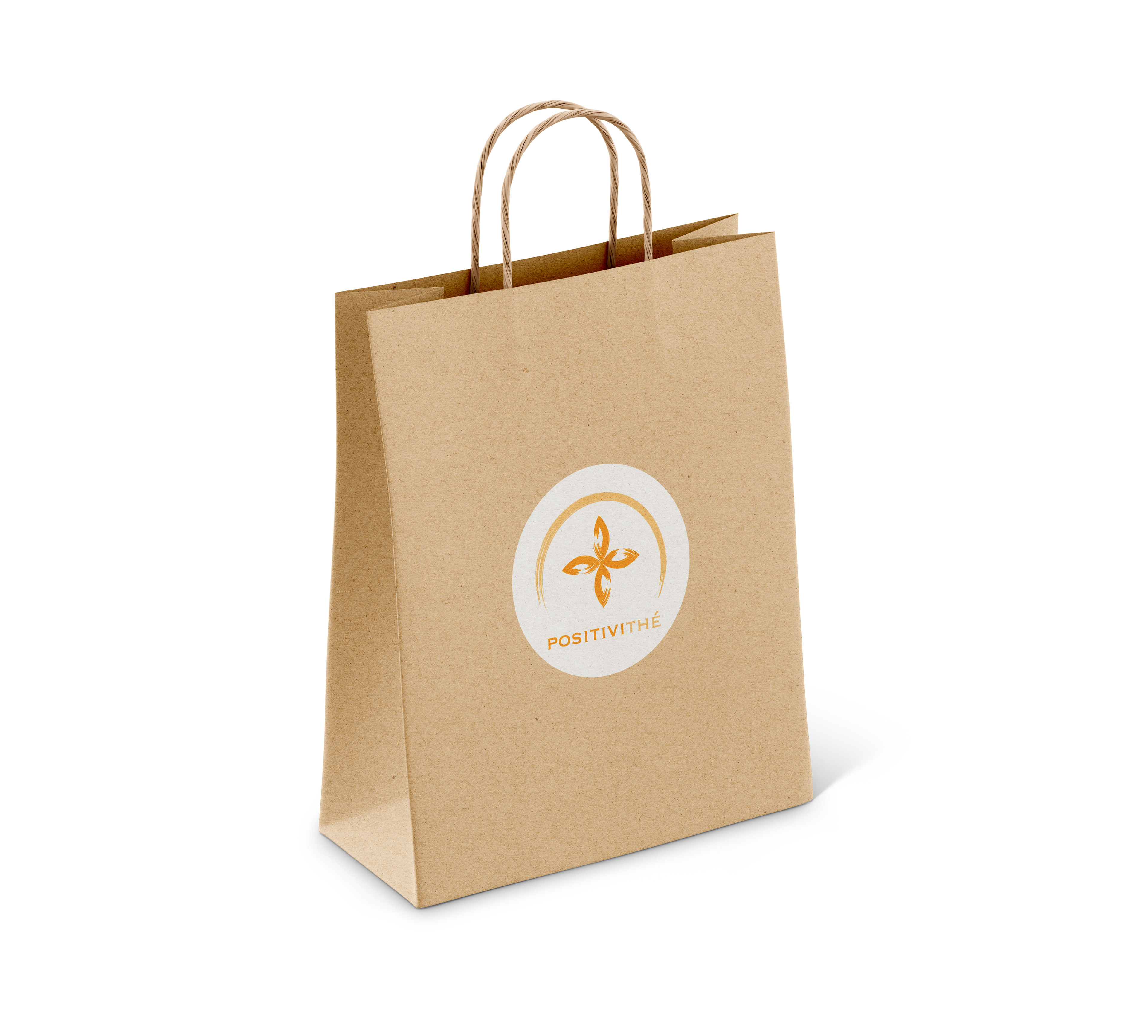
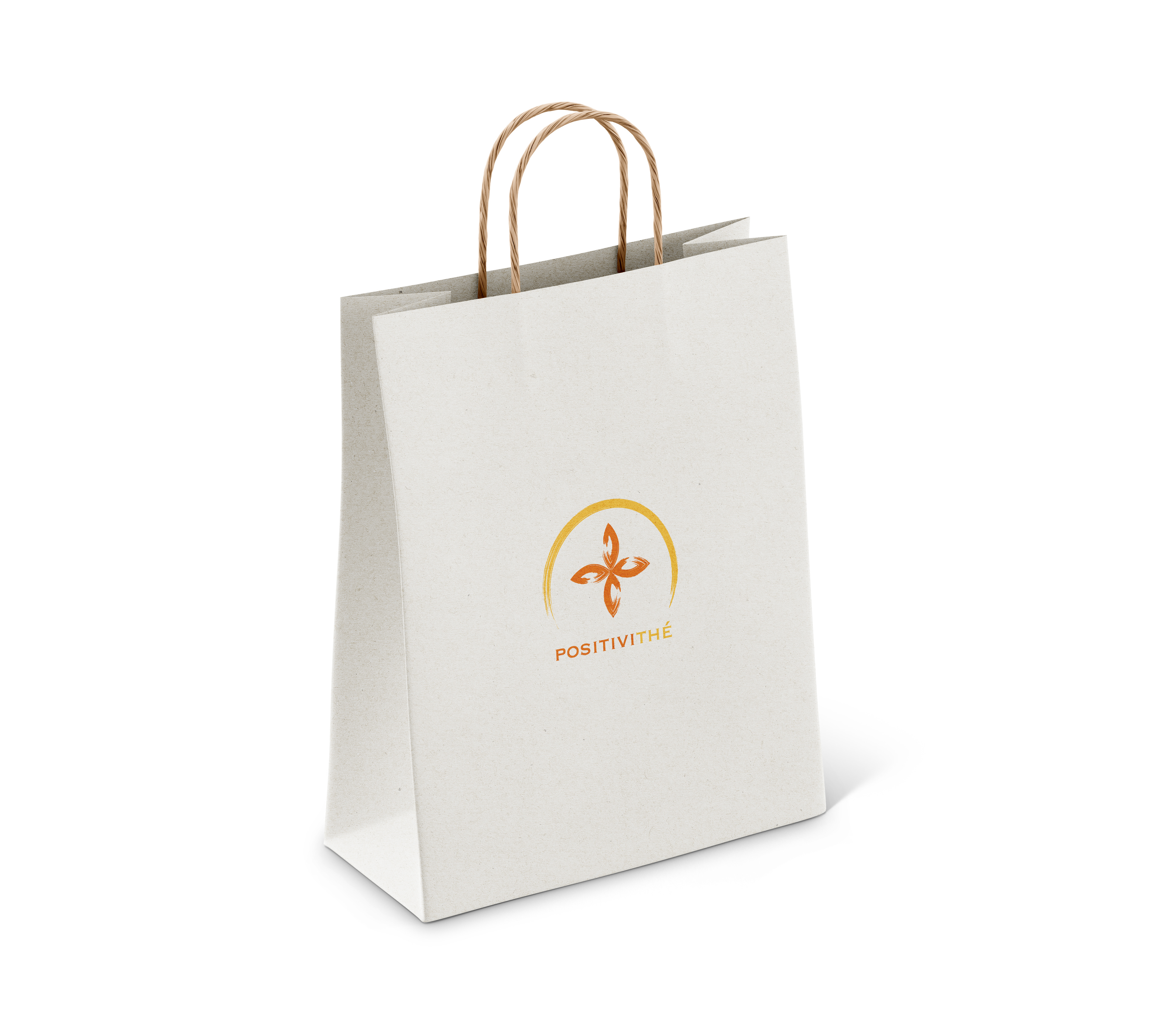
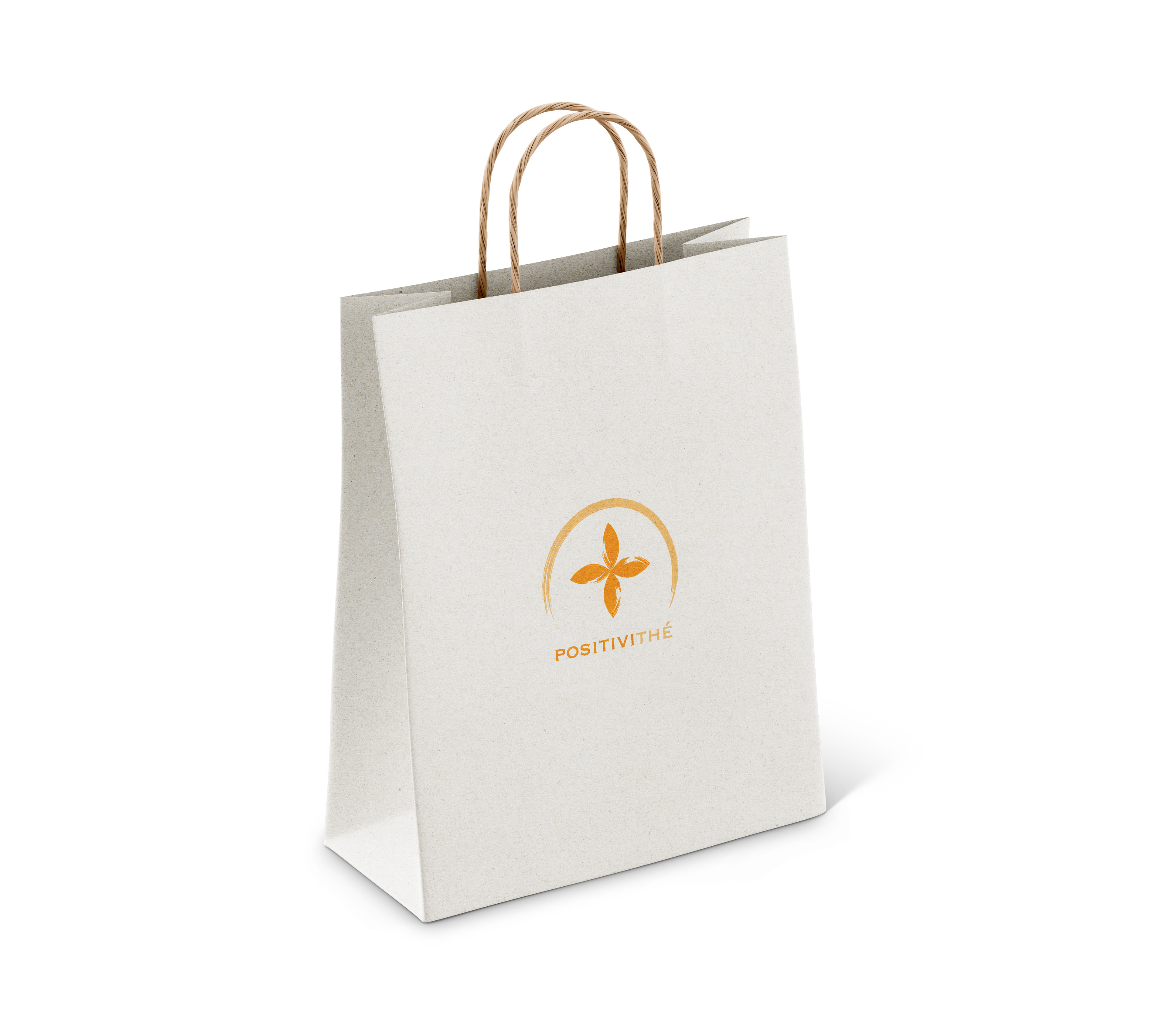

I also presented several mockups of how the logo might be used as stickers on paper bags, which was the how the client planned to use as packaging for the early stages.
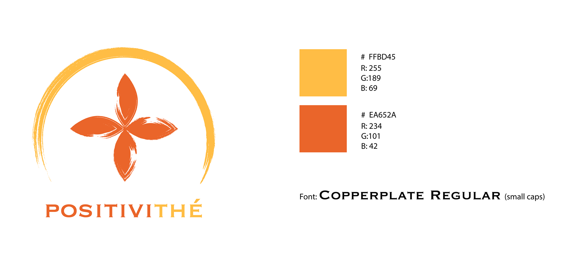
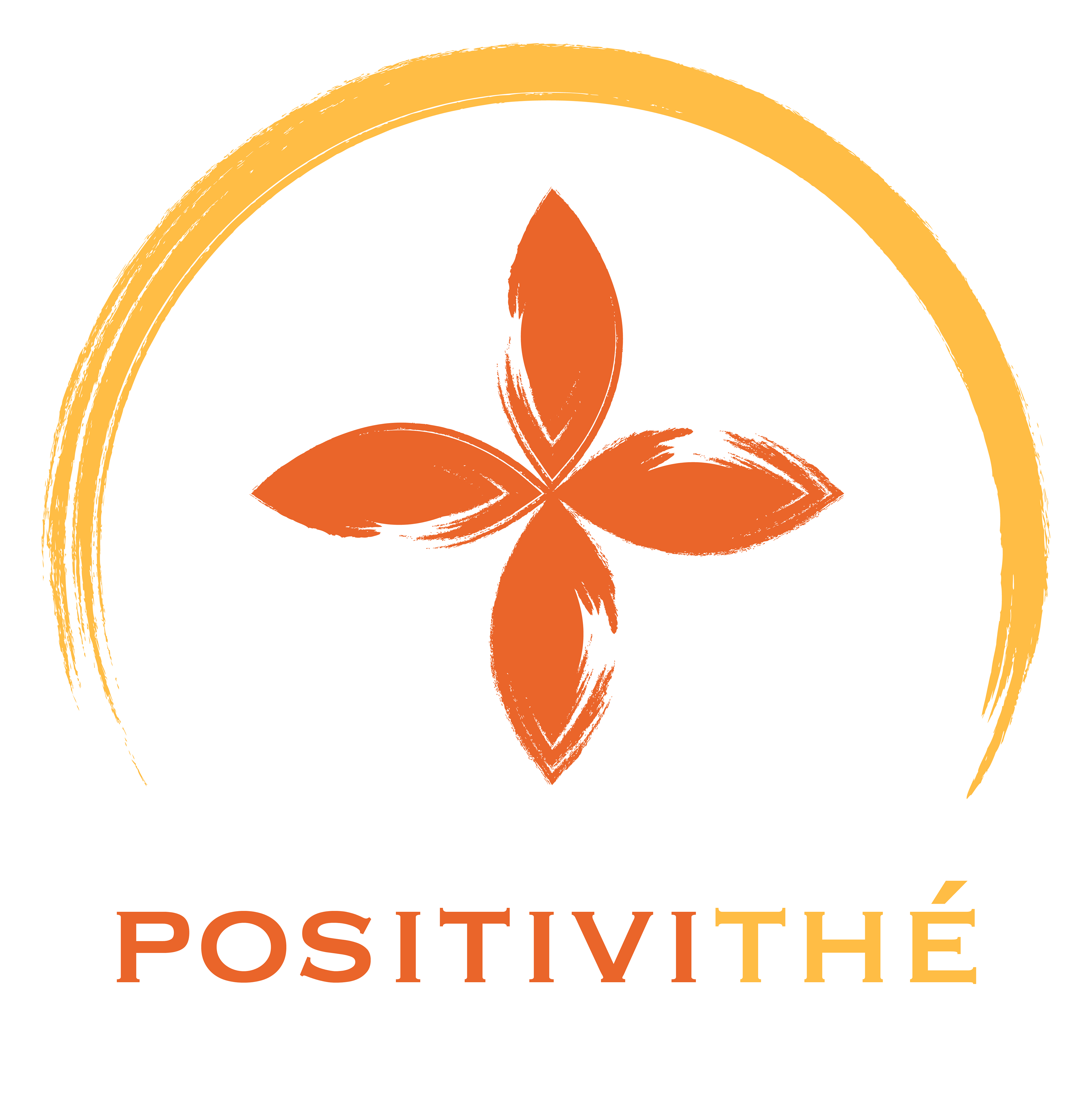
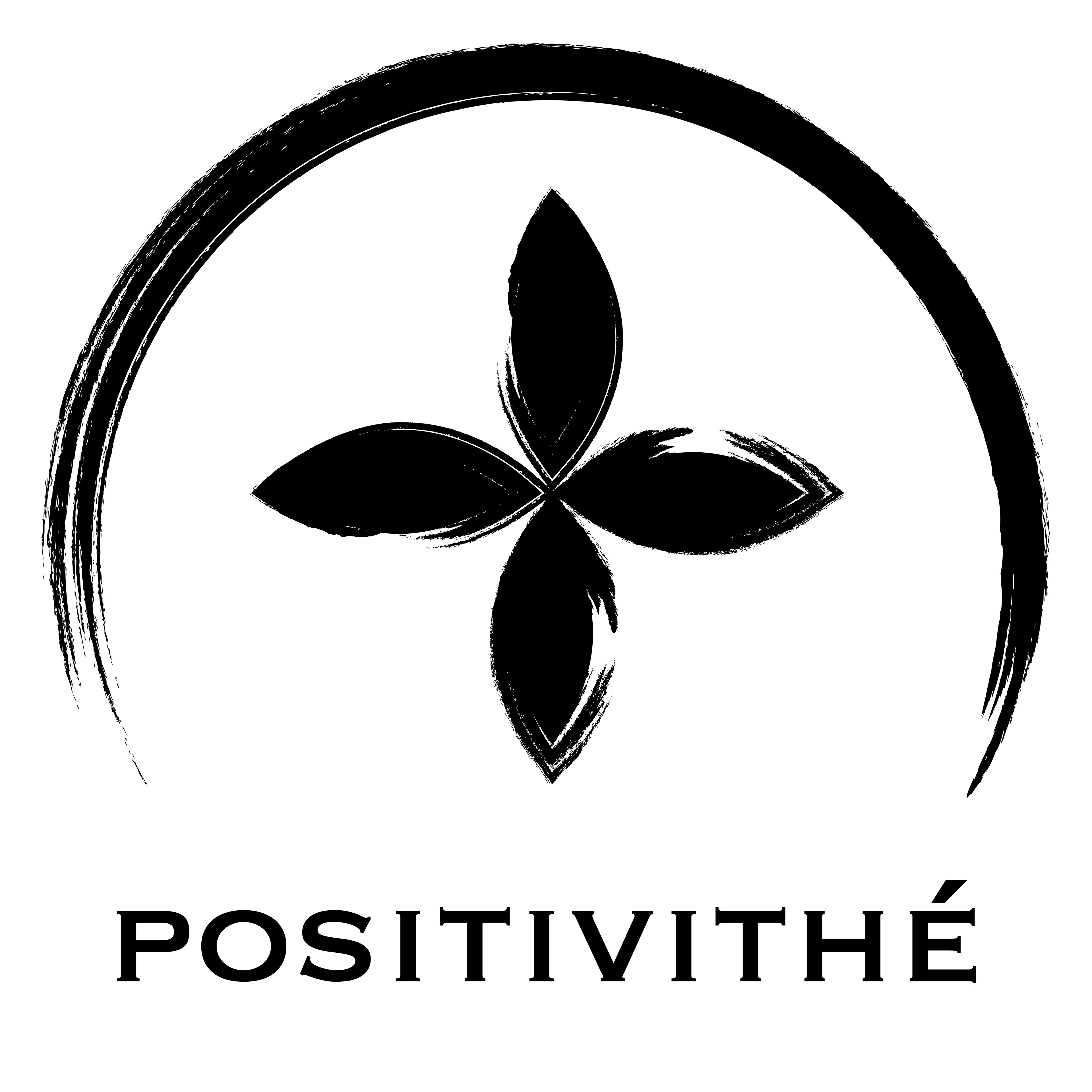
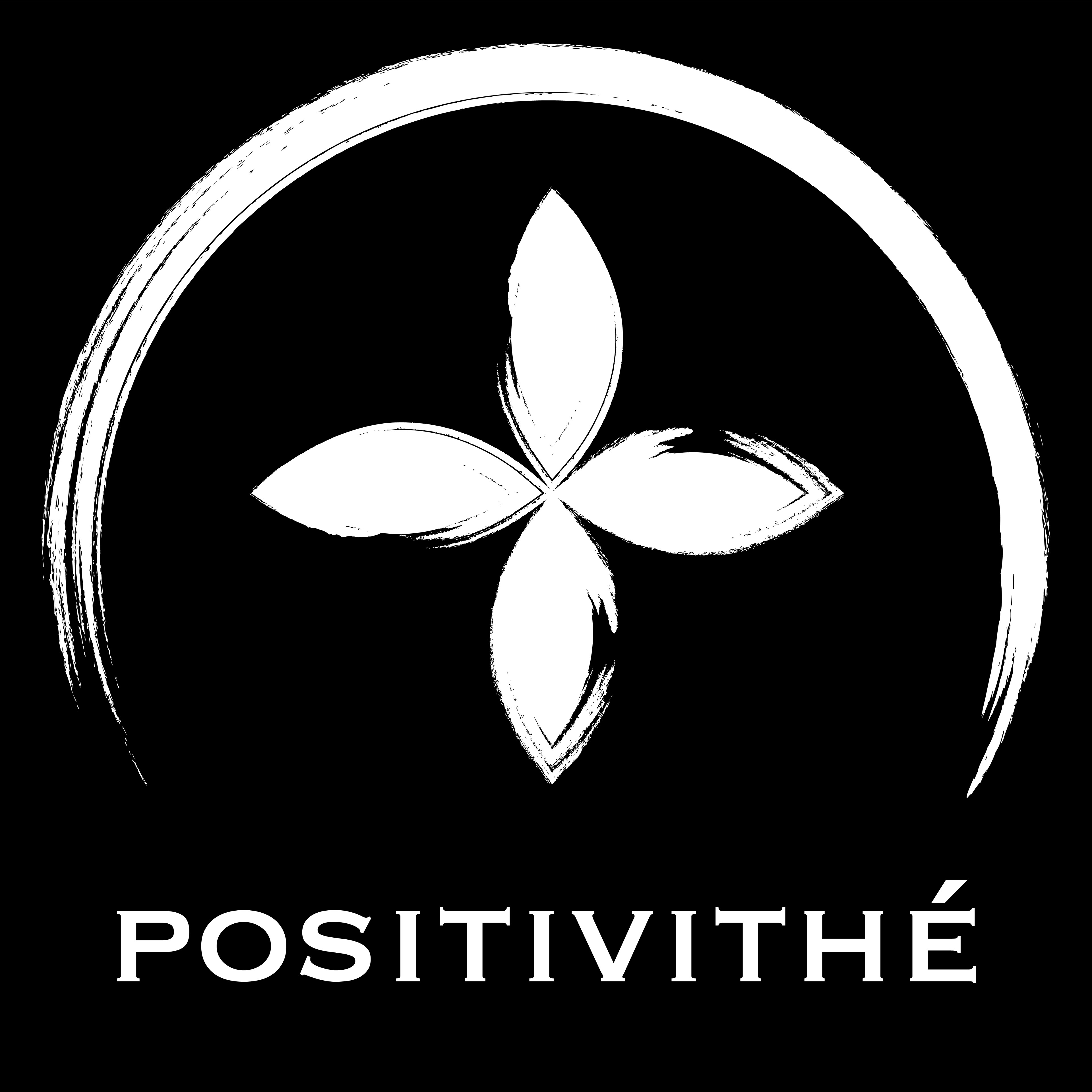
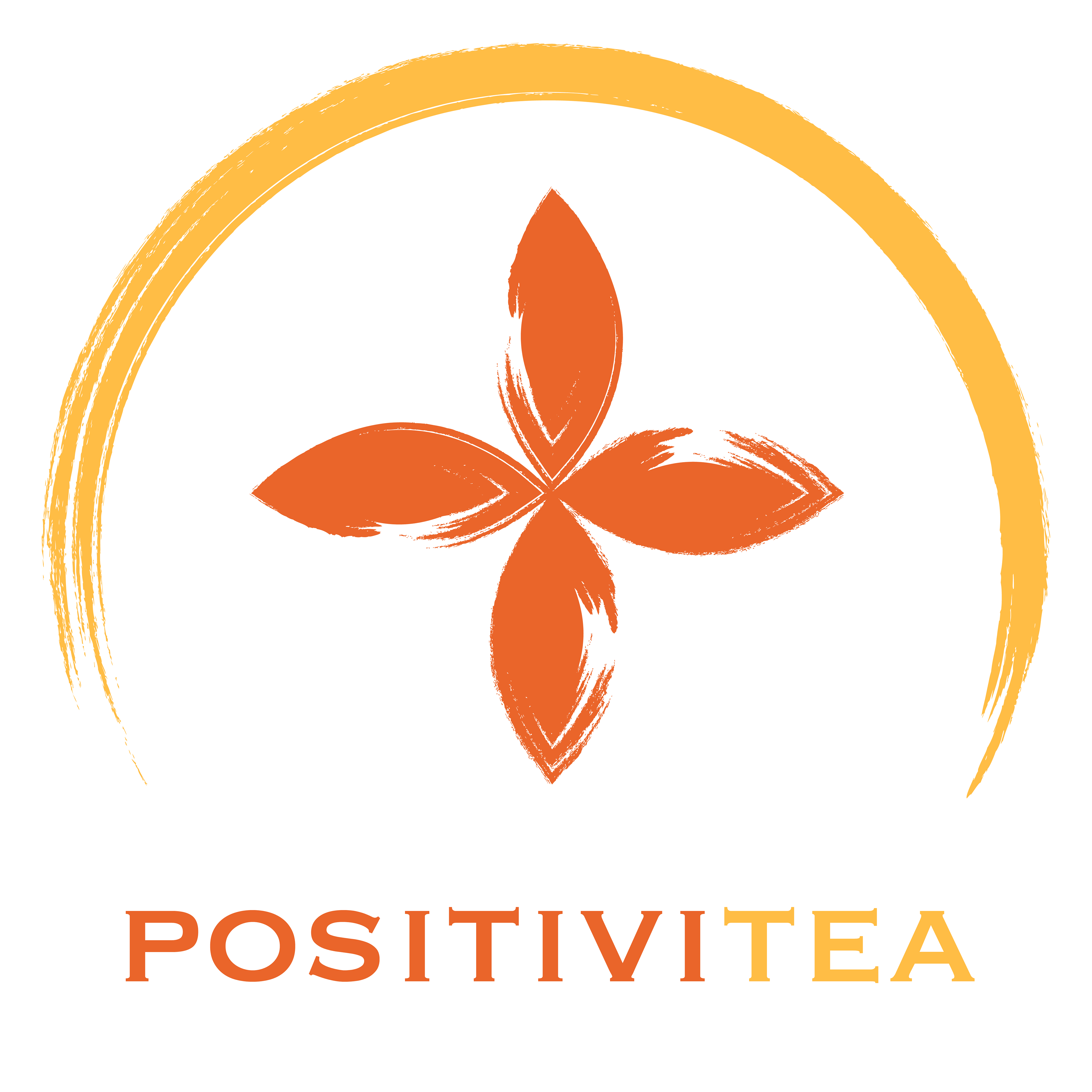

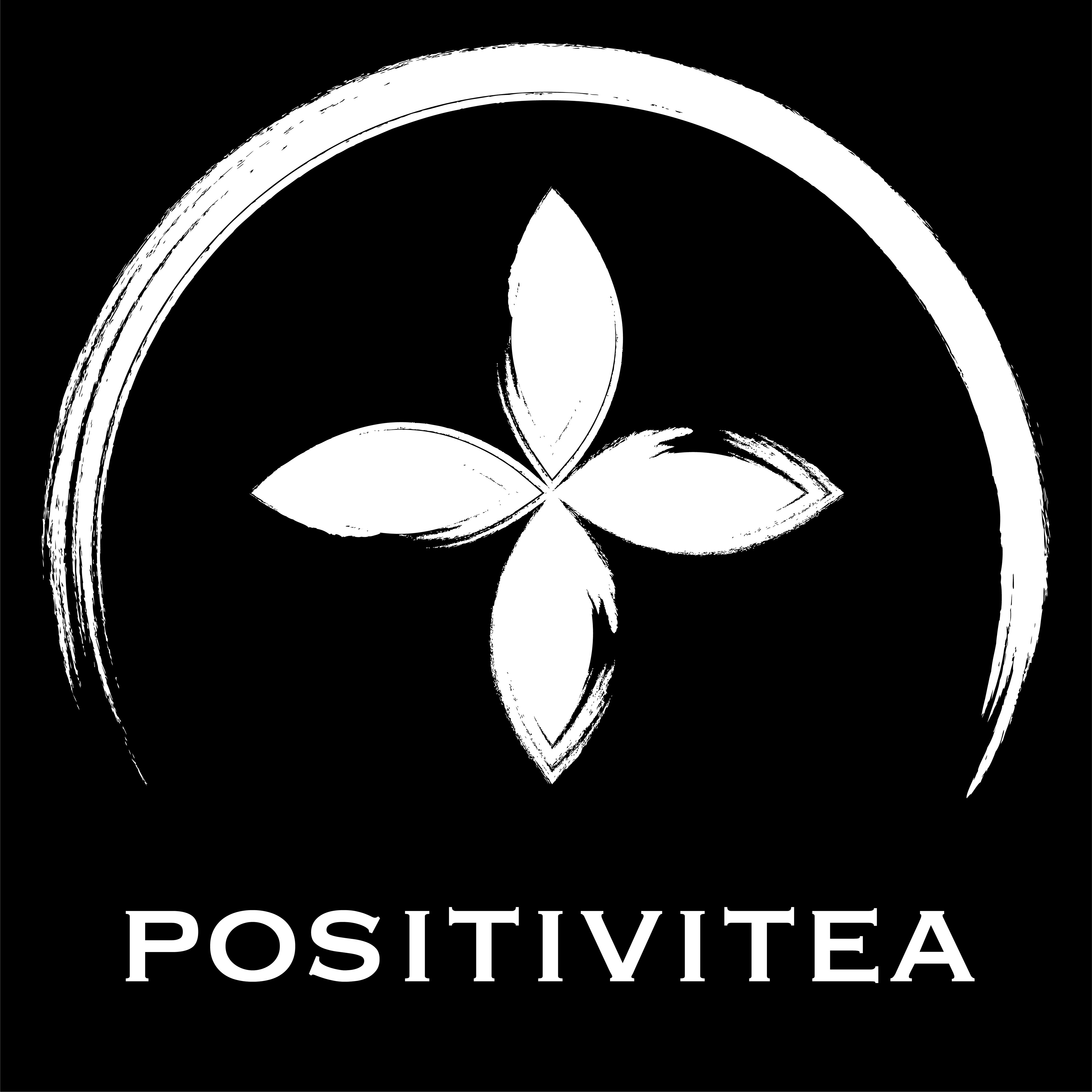
Here is the final logo design! It utilizes tea leaves to form a + sign within a circle to enclose and complete the whole image with a simple text for the brand name in both French and English!